
To view this newsletter in different languages — see the web page version
Yamazumi Work Load Balancing |
|
YamazumiThe Yamazumi Workload Balance Chart is very easy to use, and is one of the most popular lean tools:
Popular Features
Major UpgradeUser-defined Categories for whatever analysis might be helpful for your unique industry or process. Chart Labels At any time, you can refresh your chart labels to show (or not show):
The bottom chart axis labels also show the total time per Operator (or team). Chart Colors At any time, you can switch between chart colors based on:
And your leaders can easily personalize your own preferred chart colors. Product Mix What if you have a process that makes more than one thing? Unhide the Product Mix columns. Unlimited Work Elements In addition to the unlimited Operators or Teams (which have always been supported)... your Yamazumi Chart can now support unlimited Work Elements. But Excel charts can only support 255 series... Zoom If you have over 255 Work Elements (or even if you don't), you can use the new Zoom feature, to choose up to 6 operators to highlight, and then use 'Show All' to either:
Deeper Standard Work Analysis It is now easier to copy data from your Standard Work template, which you can use to perform much deeper standard work analysis to answer questions that a Yamazumi chart was never intended to answer. Questions like:
And with a click of a button,
 Why re-invent?
| ||||
|
Existing customers get all the latest templates each time you upgrade. Although most customers choose to renew annual maintenance once a year - you have the option to upgrade your templates at any time.
See What's New
|


|
Run Charts
your Systems2win Run Chart template empowers you with several additional useful features: * Range of variability * Switch between median and average * Optional multiple data lines * Easily transpose horizontal or vertical data * 3 print options (for level of detail)
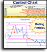
Control Chart
Cycle Time Chart
Trend ChartsYes, your Run Chart template can easily turn off and on a Trend line,
If your organization has not yet provided a license, then why not own yours now so that you too can start delivering
| ||||||||
|
Special OfferIf you do not yet own then you can use coupon code: 499SEP to own all 150+ process improvement tools for only $499
If you've been putting it off, This coupon expires September 30th
|
||||||||
|


|
||||||||
|
New User TrainingWhenever you need to train a new team member how to use those features that are common to most of your 150+ Systems2win templates... Each user has 2 choices: 1) Self-paced learning exercises 2) Attend a free live webinar
Free Live Instructor Led Class This Wed, September 21, 1pm Central Time In depth training, and hands-on learning exercises for (licensed) new users
All times are Central Time from Nashville Tennessee, (which is the same as Chicago)
|


You are receiving this newsletter either because you are a customer,
or because you subscribed when you visited
Systems2win.com.
In compliance with CAN-SPAM, we will immediately honor any request to unsubscribe.