
Process Improvement Tools.
Standard Work.
Work Instructions.
Flow Chart templates.
Swim Lane Cross Functional Flowchart.
Value Stream Mapping.
Lean tools.
Time Study templates.
DMAIC tools.
Quality Improvement tools.
House of Quality QFD.
FMEA Risk Reduction.
Root Cause Analysis tools.
Problem Solving tools.
OEE.
Preventive Maintenance.
Skip to main content


Installation and Setup
Installation - Each User. Installation - Multi-user. Language Translations. Personalize Your Templates.Systems2win Training.
Quick Start Initial Training. New User Training. Training Matrix. Systems2win Leadership. Training Classes.Lean Training
Lean Training and Coaching. Lean Principles. Muda 8 Wastes. Goal - Lean Flow. Roadmap - Lean Journey. Value Stream Mapping. Standard Work. Hansei Lean Thinking. Lean Dictionary. Online Lean Training. Lean Leadership.Microsoft Office Training
Excel Training. Excel Drawings (without Visio). Excel Charts. Word Training. PDF Training. Document Storage and Naming.Support
Support.Check Sheet template
aka Frequency Table, Quality Check Sheet, Frequency Table Maker, or Tally Sheet template
What is a Frequency Table used for?
Also comes with
Trends template
- Objectively observe and measure defects
and events that are believed to possibly contribute toward defects
- Provide a basis for clearly-defined operational definitions
of what a defect is and is not
- Keep data collection as simple and easy as possible
Usually using simple hand drawn check marks
- Identify root causes of problems
- Provide a structure for uniform data collection and interpretation
- Serve as a base for creating charts, Pivot Tables, and other forms of data analysis
- Provide objective, measurable data to substantiate or refute opinions and theories
How to use your Check Sheet template
The worker or team gathers data in real time at the place where the work happens — making simple hand-drawn hash marks on the printed Check Sheet template each time that a problem occurs, or each time an event occurs that is believed to contribute toward causing problems.
Although you can do some limited data analysis on this same sheet...
the data from your Check Sheets becomes increasingly valuable when collected over a long period of time
so you will get much more insightful analysis when you summarize your data to your Trend Analysis Scorecard and/or your Histogram template
How to use your
Check Sheet template
Personalize your template
See the training below for how to personalize.
Train your workers
Train your people how to use your personalized form perhaps using the TWI Job Instructions method
Find and open your template
Find and open your Check Sheet template
(CheckSheet.xlsx)
in the same way that you find and open your other 150+ Systems2win templates.
Save your working document
following the usual document storage and naming conventions established by your leaders
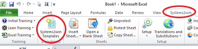
Open a Blank Sheet
When you're ready to start doing your own real work...
click the button to 'Open a Blank Sheet'
Excel Ribbon > Systems2win tab > Open a Blank Sheet
This blank sheet is where you will do your real work
(not on the Sample sheet — which gives you sample data that is extremely helpful for learning how to use your new tool, but is the wrong place to do your real work)
Rename your new sheet.
Or... Insert Sheet
As an alternative to opening a stand-alone document (as instructed above), you also have the option to Insert Sheet into any other Excel workbook.
If English is not your preferred language
Switch to your language, just like every Systems2win Excel template.
Now your team is ready to get started using your
Frequency Table template
Print your Check Sheet
The purpose of a Check Sheet is to collect data about quality problems when and where they happen.
And that usually means manually entering data onto a clipboard, not entering data into a computer.
Collect Data
Using either simple hash marks or your agreed-upon symbols.
Analyze — using your Trends Scorecard
Count the number of times that each problem occurred during each time period, and enter the summary number in the corresponding cell in your Trends Analysis workbook.
Use your Trends Analysis template (Trends.xlsx) to easily generate charts and a Visual Scorecard
that can then be analyzed, printed, published, and archived.
Tip: When copying between workbooks,
you might need to transpose between horizontal and vertical data
Optionally add charts and other forms of analysis
Although you will usually use a Check Sheet only to gather data
(which is then summarized and analyzed using your Trends template)
you also have the option to do some analysis right within the Check Sheet workbook itself
perhaps using Insert Sheet to add a Pareto Chart, a Histogram, and/or any other type of Excel chart.
How to personalize your Tally Sheet template
One of the biggest benefits of using ANY Systems2win template is that you can use everything you know about Microsoft Excel to make your document yours.
1) Define the types of problems, defects, or events that you want to analyze
Personalize your header fields with 'problem' categories that define anything that might go wrong with your process
2) Define the time columns
which might be days, shifts, am/pm, or any other consistent unit of time.
Familiar Microsoft Excel
Use everything you know about familiar Word and Excel
3) Define any user-defined columns
If your data collection time period is not (the default) 1 week, then hide or copy columns, and perhaps change column header titles.
to any other consistent time period - such as shifts, days of the month, am or pm, etc
Data should be collected in consistent time periods even if producing different deliverables within or between time periods.
You might use a User-Defined column for Product/Family, but that should be for informational purposes only.
It's Excel. You already know how to easily add unlimited user rows or columns.
Simply hide unused columns.
4) Define your Operational Definitions
to ensure that everyone collects and interprets data in the same way.
Perhaps link to your Operational Definitions template (Op_Def.xlsx)
5) Optionally hide or unhide the section for the Defect Concentration Diagram
which can contain a picture or diagram of the object
perhaps overlaid with clearly defined boundary markers, so that the data entry person can indicate where each type of problem occurs, perhaps using agreed-upon symbols for each type of problem.
6) Define your symbols (optional)
Usually, you will use an ink pen to draw a simple hash mark to indicate each time that a problem occurs during each time period.
If using a Defect Concentration Diagram, then a symbol can be associated with each problem (row), to visually identify where each problem occurs.
A variation (without the Defect Concentration Diagram) is to use symbols to differentiate between different causes that manifest the same problem.
If you use Symbols — be sure to provide a Legend of what each symbol means.

7) Set the Print Area
Set the Print Area.
Perhaps change Print Orientation (between portrait or landscape)
And perhaps rearrange columns to be within our outside of your desired Print Area.
This Check Sheet template and the Trend Charts template come with many other useful Six Sigma tools and Quality Improvement tools
to empower every team member to improve every process
New User Training
Your Systems2win templates come with free New User Training
to quickly learn features that are common to all 150+ templates
How much free time
do you have?
to re-invent and support
home-made tools?
Own Yours Now
Own your own professional tools
that you can take with you for the rest of your career