
Process Improvement Tools.
Standard Work.
Work Instructions.
Flow Chart templates.
Swim Lane Cross Functional Flowchart.
Value Stream Mapping.
Lean tools.
Yamazumi Chart template.
Time Study templates.
DMAIC tools.
Quality Improvement tools.
House of Quality QFD.
FMEA Risk Reduction.
Root Cause Analysis tools.
Problem Solving tools.
OEE.
Preventive Maintenance.
Skip to main content


Installation and Setup
Installation - Each User. Installation - Multi-user. Language Translations. Personalize Your Templates.Systems2win Training.
Quick Start Initial Training. New User Training. Training Matrix. Systems2win Leadership. Training Classes.Lean Training
Lean Training and Coaching. Lean Principles. Muda 8 Wastes. Goal - Lean Flow. Roadmap - Lean Journey. Value Stream Mapping. Standard Work. Hansei Lean Thinking. Lean Dictionary. Online Lean Training. Lean Leadership.Microsoft Office Training
Excel Training. Excel Drawings (without Visio). Excel Charts. Word Training. PDF Training. Document Storage and Naming.Support
Support.Excel Scatter Plot template
aka x-y graph, scatter diagram, scattergram, scatter graph, scatter chart
What is a Scatter Plot?
A scatter chart graphically shows the relationship between two sets of data.
It can also be used to determine whether the two variables might be correlated.
When to use an X-Y Graph Scatter Diagram
Use your Excel Scatter Plot template to determine whether two sets of numerical data might be related
- Use it to brainstorm potential causes when performing Root Cause Analysis
- Use it to scientifically determine whether suspected causes and effects are closely related
- Use it to determine whether two effects that appear related both happen with the same cause
Sample Scatter Plot example
How to use your
Excel Scatter Plot template
Find and open your template
Find and open your Scatter Plot template
(ScatterPlot.xlsx)
in the same way that you find and open your other 150+ Systems2win templates.
Save your working document
following the usual document storage and naming conventions established by your leaders
Open a Blank Sheet
When you're ready to start doing your own real work...
click the button to 'Open a Blank Sheet'
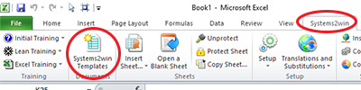
Excel Ribbon > Systems2win tab > Open a Blank Sheet
This blank sheet is where you will do your real work
(not on the Sample sheet — which gives you sample data that is extremely helpful for learning how to use your new tool, but is the wrong place to do your real work)
Rename your new sheet.
Or... Insert Sheet
As an alternative to opening a stand-alone document (as instructed above), you also have the option to Insert Sheet into any other Excel workbook.
(which also gives you the option to Link Data so that your chart instantly changes as your data changes)
If English is not your preferred language
Switch to your language, just like every Systems2win Excel template.
Now your team is ready to start using your
X-Y Graph Scatter Diagram
Enter Titles for your X and Y data
In the pink cells at the top of the page above the Print Area, enter a Title for the horizontal X Axis, and a Title for the vertical Y Axis.
The Titles that you enter in these cells will also appear in the clear text boxes above the gold column headers for X and Y, and as the Axis Titles in your scatter graph.
Enter header data
Title
Brief description of the primary purpose of this document.
The Title that you enter here will also appear as the Title in your scatter chart.
Author
The Author is the one person (or team) authorized to make changes to this document.
Revised Date
To change date format: Right-click > Format Cells > Number tab
You'll get a lot more out of this training if you have your template open in front of you
Header Data
Any data that you want at the top of your document.
Tip: Hide unused rows. Or copy this row for unlimited user-defined header data.
Optional Comments Text Box
You can hide or unhide rows for the Comments text box.
You can leave the Comments text box where it is, or optionally move those rows anywhere else.
You can copy those rows for additional Comments text boxes.
Comments text boxes can be within the Print Area, or outside of the Print Area.
Enter your X-Y Graph data
In the X and Y columns, enter your numerical data.
Each row must have a matched pair of data for both X and Y.
In other words, each column must have the same number of data elements.
Optional Descriptions
Description is optional, (and often not used).
If your description is a date, then you can change the cells to Date format.
Right-click > Format Cells > Number tab
If you want to show your Descriptions as data point labels on your chart...
then use the special button
In the Systems2win menu in the Excel Ribbon bar, select 'Apply Chart Labels'
Optionally format your Scatter Chart
Select your chart, and then in the chart-related tabs that appear in the Excel Ribbon bar, you can use everything that you know (or learn) about familiar Microsoft Excel to format your chart anyway that you like it.
Tip: If you want your chart labels to show X or Y data, rather than Description...
select 'None' for Chart Labels to remove the Descriptions and start fresh.
Analyze your Scatter Plot Diagram
The chart will instantly change as your data changes.
Tip: You can use everything you know (or learn) about Excel Charts to change colors, styles, fonts, etc.
Look for a pattern in the data points.
Copy Chart
Your Systems2win menu includes a special utility to 'Copy Chart' that copies a picture of your chart to the clipboard, where it can then be pasted to any other document.
(which might be Excel, Word, PowerPoint, etc.)
How to use your Scatter Plot template for
Correlation Analysis
Just below the header section and above the scatter chart, you can optionally hide or unhide rows for the Analysis section.
As delivered... there is only one formula in the Analysis section... the formula for Correlation because we believe that for most users, (who are not statisticians), that is the only formula that is needed.
You don't need to understand the Correlation Formula
The correlation formula is the Pearson product moment coefficient,
and you can look that up on the Internet to get detailed explanations of exactly how it is calculated and why...
bur our philosophy is that you don't need to learn how to build a power plant in order to plug into an electric socket
All that you need to know is...
How to interpret the results of the Correlation Analysis
If you speak English, then think of 'r' as 'relationship'
Option 1) Positive Correlation
If r is positive, then there is a positive correlation.
The more that one thing happens, the more that the other will happen too.
A small number means a weak correlation.
Sometimes the other thing happens; sometimes it doesn't.
If r is +1, then there is perfect (maximum) positive correlation.
Every time that one thing happens, the other will always happen.
Important Reminder: Correlation is not the same as 'cause and effect'.
Just because two things happen together (or opposite of each other) doesn't mean that one causes the other.
There might be some other outside factor (or factors) that influence both of the things you are studying.
Option 2) Negative Correlation
If r is negative, then there is a negative correlation.
The more that one thing happens, the LESS that the other will happen.
If r is -1, then there is perfect (maximum) negative correlation.
Every time that one thing happens, the other will NOT happen.
Option 3) No Correlation
If r is zero, there is no correlation.
There seems to be no relationship between how often the two things happen.
Option 4) #N/A Error
There are a different number of values in the 2 columns.
Solution: Every value in one column needs a matching value in the other.
Option 5) #DIV/0! Error
Either one of the columns is blank, or all of the values in a column are identical (so the standard deviation of the values equals zero)
Solution: Change one of the identical values to be slightly different.
Example: If all of the values are 6, change one to 6.0001
That's all that most users want (or need) to know
- Is there a Correlation between the two factors?
- Is it a positive or negative correlation?
- How strong or weak is it?
More Correlation Analysis
Regression Analysis
In the Analysis section, you can optionally add an unlimited number of user-defined rows to use everything that you know (or learn) about Microsoft Excel functions to further analyze your data.
For example...
If, in your Black Belt training, you learned how to use Excel's LINEST() function, then you can easily analyze your data for all of the regression analysis data that is generated by that Excel function
which uses the Least Squares method to return a whole slew of numbers that only trained statisticians or Black Belts will understand
LOGEST() is similar to LINEST
but for analyzing values that fit an exponential curve, rather than a linear relationship
TREND() for linear or GROWTH() for exponential trends
INTERCEPT() and SLOPE() for more statistics that require special training to understand
We could have chosen to pre-program all of those confusing statistics, but...
Your Systems2win scatter plot template is designed to be easy
Easy enough for a Green Belt to use.
Easy enough for a non-statistician to use.
For 99% of users, the (much simpler) Correlation Analysis
provides information very similar to Regression Analysis
in a way that is much easier to understand.
In those rare cases when you believe that your scatter graph data deserves further analysis...
you can either:
- Go for it... using everything that you know (or learn) about familiar Microsoft Excel
- or seek the assistance of your Black Belts to perform any one of 25 different types of Regression Analysis
Suggested Reading and Resources for your
Excel Scatter Plot template
See ExcelFunctions.net to learn more about how to use Excel functions
Another template similar to the Scatter Diagram is the Quadrant Chart
This scatter plot template is one of the 7 Basic Tools of Quality
to empower every team member to improve ever process
Contents
New User Training
Your Systems2win templates come with free New User Training
to quickly learn features that are common to all 150+ templates

Support
One huge benefit of owning your Systems2win templates is Support when you need it
Training and Coaching
Consider Training and Coaching to support your teams to succeed
Training to get you started.
Tools you won't outgrow.
Schedule a Conference
Schedule a conference
to discuss your challenges
with an experienced lean advisor
150+ Templates
Try Some
Own Them All
Download Trial Now
Get a dozen trial templates,
and another dozen free gifts
@@@ Better conversion rate
if call to action is for a specific tool, and shows the image
Try It
Try this template
along with a couple dozen more
process improvement tools
Calls to Action Botttom

Related Topics
Related Topics section WITHOUT TESTIMONIALS
Replace this paragraph with menu library item for topics related to this video
Training and Coaching
Consider Training and Coaching to support your teams to succeed
Training to get you started.
Tools you won't outgrow.
Schedule a Conference
Schedule a conference
to discuss your challenges
with an experienced lean advisor