
Process Improvement Tools.
Standard Work.
Work Instructions.
Flow Chart templates.
Swim Lane Cross Functional Flowchart.
Value Stream Mapping.
Lean tools.
Yamazumi Chart template.
Time Study templates.
DMAIC tools.
Quality Improvement tools.
House of Quality QFD.
FMEA Risk Reduction.
Root Cause Analysis tools.
Problem Solving tools.
OEE.
Preventive Maintenance.
Skip to main content


Installation and Setup
Installation - Each User. Installation - Multi-user. Language Translations. Personalize Your Templates.Systems2win Training.
Quick Start Initial Training. New User Training. Training Matrix. Systems2win Leadership. Training Classes.Lean Training
Lean Training and Coaching. Lean Principles. Muda 8 Wastes. Goal - Lean Flow. Roadmap - Lean Journey. Value Stream Mapping. Standard Work. Hansei Lean Thinking. Lean Dictionary. Online Lean Training. Lean Leadership.Microsoft Office Training
Excel Training. Excel Drawings (without Visio). Excel Charts. Word Training. PDF Training. Document Storage and Naming.Support
Support.Quadrant Chart template
Excel template for perceptual map, importance-performance analysis, and other quadrant charts
What is a Quadrant Chart?
Also known as a multi dimensional chart, or a two-dimensional chart
The many types of quadrant charts are all designed to help you
visually understand relationships between two factors affecting an issue
Types of Quadrant Charts
One of the most versatile tools in your toolkit; there are many variations of the two-dimensional chart.
Here are a few of the more popular ones, and once you get the idea,
you will undoubtedly create a few unique variations of your own!
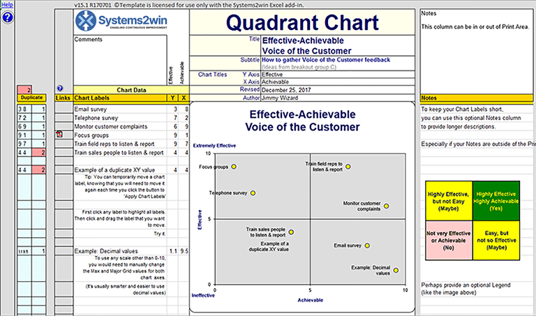
Effective-Achievable Chart
Vertical Y Axis = Effectiveness of each Alternative
Horizontal X Axis = Achievable
Every Alternative is somewhat effective and achievable, or it wouldn't be on your list.
Ratings should compare the relative merits of each Alternative.
When to use
- To choose from a list of alternatives
such as projects to undertake, countermeasures to implement, methods to deploy...
- To do the comparison quickly
- To communicate and justify a decision to other stakeholders
Sample Quadrant Chart Example
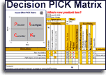
Your Decision PICK Impact-Effort Matrix (DecisionPICK.xlsx)
has even more robust features and specific training for Effective-Achievable analysis, and allows you to easily click a button to switch between:
- Impact-Effort PICK Matrix
the target "best choice" quadrant is the upper left
- Effective-Achievable Matrix
the target "best choice" quadrant is the upper right
Plan-Results Chart
Vertical Y Axis = Plan
Did we implement our assignments as planned?
Horizontal X Axis = Results
Did we reach the milestones and harvest the results we expected?
Rating Scale
The scale for Plan might range from "accomplished nothing" to "completed everything perfectly as planned"
and for Results might range from "actually hurt our cause" to"exceeded expectations"
| Plan implemented |
Bad Plan Not the root cause? |
Congratulations Opportunities to extend your success learning lessons to other projects? |
| Plan not implemented |
Likes Wrong root cause? |
You Got Lucky Analyze measures of process (not just end results), to understand how you got lucky. |
| Results not reached | Results reached |
When to use
- After a countermeasure has been implemented and tested
- After a project has been completed
- When a project is floundering (or dead)
Importance-Performance Analysis
Vertical Y Axis = Importance of each Alternative
Horizontal X Axis = Performance
The Importance-Performance Matrix analyzes customers' perceptions about the importance and performance of deliverable products or services.
Rating Scale
The scale for Importance might range from "not important" to "critical", and the scale for Performance might range from "consistently unacceptable" to "greatly exceeds expectations"
When to use
- When surveying customer perceptions
- To better understand how to delight customers
- To compare the perceptions of different types of customers
- To compare perceptions of internal staff vs. perceptions of external customers
- To listen to the voice of the customer
(to understand them; not argue with them)
Perceptual Map Quadrant Chart
The Y Axis, X Axis, and Rating Scale can be just about anything that your customers care about
Any axis scale might measure increments from Boring to Fashionable, Conservative to Sporty, Affordable to Distinctive...
ANY scale of ANY perceptions that your customers might have about your offerings.
Tip: With such diverse & unusual scales, it is especially important to edit the text boxes to your chart so that each end of each axis has its own label.
For example, rather than a single scale of "Social Interactiveness", you might want one end of the scale to be "Social Appeal" and the other end of the scale to be "Individuality", thereby further clarifying a nuanced scale that appeals to different types of customers at both ends of the scale.
When to use a marketing perceptual map
- Pretty much the same as when you would use an Importance-Performance Matrix.
A marketing perceptual map simply opens much wider possibilities for measuring unique customer perceptions.
Competence-Motivation Chart
Y Axis = Competence
Does this employee have the knowledge and skills to do this job?
X Axis = Motivation
Is this person motivated to perform these responsibilities?
When to use
- To decide how to manage different types of people
| Competent | Motivate What's in it for them? |
Delegate Block for person carrying the ball, and get out of their way. |
| Not Competent | Fire Find someone else |
Train What does this person need to succeed? |
| Not motivated | Motivated |
Other Quadrant Chart Variations
Impact-Control Chart
How much control does your team have over the success of each alternative?
There are dozens or hundreds of different types of two-dimensional charts.
Get creative, and make your own to visually communicate the relationship between ANY two factors affecting any decision.
How to use your
Quadrant Chart Excel template
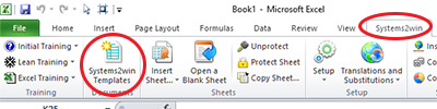
Find and open your template
Find and open your Quadrant Chart template
(Quadrant.xlsx)
in the same way that you find and open your other 150+ Systems2win templates.
Save your working document
following the usual document storage and naming conventions established by your leaders
Open a Blank Sheet
When you're ready to start doing your own real work...
click the button to 'Open a Blank Sheet'
Excel Ribbon > Systems2win tab > Open a Blank Sheet
This blank sheet is where you will do your real work
(not on the Sample sheet — which gives you sample data that is extremely helpful for learning how to use your new tool, but is the wrong place to do your real work)
Rename your new sheet.
If English is not your preferred language
Switch to your language, just like every Systems2win Excel template.
Now you are ready to start using your
Quadrant Chart template
Define the decision that needs to be made
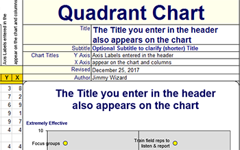
Perhaps overwrite the big title at the top of the page —
replacing the words 'Quadrant Chart' with the name of the type of the chart you are creating.
For example Effective-Achievable Chart, Importance-Performance, Perceptual Map... See Variations above
The Title should be short — because whatever you type there will also appear as the Title in the chart.
The optional Subtitle can be a longer description of the problem to be solved.
Ensure that everyone understands and agrees upon what is to be decided.
Use your Operational Definitions template if needed.
Edit Titles for your X and Y data
The X and & Axis Titles that you type in the header will also appear:
- in the clear text boxes above the gold column headers for X and Y
- and as the Axis Titles in your quadrant chart.
Examples of X and Y Titles:
Effective-Achievable. Importance-Performance. Plan-Results...
See Variations in the training section above
Define your Rating Scale
On the DV sheet, define what each rating means — in the 0–10 Rating Scale that appears in the dropdown lists.
For example, the same score of '7' on the Y Axis for 'Effectiveness' might be defined to mean "good but not great results",
and the same score of '7' for the X Axis for 'Achievable' might be defined to mean "can be implemented with reasonable resources, but some difficulty"
The default rating scale is from 0 to 10.
To use any scale to other than 0-10, you would need to manually change the Max and Major Grid values for both chart axes.
(It's usually smarter and easier to use decimal places, rather than changing the scale.)
Optionally edit the 4 axis label text boxes on the chart to optionally replace the words "Low" and "High" with clearer descriptions of the opposite ends of your scales.
Examples: "Extremely poor" to "Outstanding". "Bright white" to "Dark black". "Despondent" to "Elated".
Any descriptions that make sense for the things YOU are measuring.
You may also need to manually move these text boxes around to align them correctly, if your chart or anything within it gets resized or moved.
Enter data in the Chart Labels column
Your Chart Labels are often your Alternatives - that you are choosing between.
To generate ideas, perhaps use brainstorming and/or hansei.
Tip: Any Excel chart has a maximum of 255 charted items.
Optional Notes
To keep your Chart Labels short...
you might use the optional column for Notes.
Tip: The Notes column can be either in or out of your Print Area.
Assign ratings
For each row, enter a number for the X and Y values.
To enter X and Y values for each row, you can either use the dropdown list, or simply enter a number.
Apply chart chart labels
In the Systems2win menu in the Excel Ribbon bar, select 'Apply Chart Labels'
Optionally format your chart
Select your chart, and then in the chart-related tabs that appear in the Excel Ribbon bar, you can use everything that you know (or learn) about familiar Microsoft Excel to format your chart anyway you like it.
How to notice duplicate X and Y values
If any row has the same X and Y values as another row,
then then there will be only 1 dot on the chart
for both (duplicated) items.
The columns just to the left of the Print Area will highlight duplicates.
How to handle overlapping chart labels
Option 1) Use shorter Chart Labels
Perhaps using the optional Notes column for longer descriptions.
Option 2) Change the value of X and/or Y
enough so that the chart labels no longer overlap
Option 3) Make the chart bigger
Increase the width of the column that contains the chart,
and/or drag the bottom edge of the chart to make it taller.
If you change chart size, then you might also need to:
Change Print Settings, perhaps to print on multiple pages, or to print on plotter paper.
Drag any text boxes that you added to your chart for additional clarification of axis values.
Option 4) Temporarily move a chart label
When you click any chart label, all chart labels will become highlighted.
Then you can click and drag the one that you want to move.
Just know that chart labels will be recreated each time that you click the button to 'Apply Chart Labels'.
Make decisions
The quadrant chart makes it easy to visually see where each alternative falls in the quadrants but your team may want to also consider additional factors before arriving at your final decisions.
User-Defined Columns
There is a hidden column (just left of the chart) that you can unhide to use for any user-defined purpose.
And you can copy that column to add unlimited user-defined columns if desired.
Suggested Reading and Resources
See suggested reading for Six Sigma tools and Decision Making tools
Another process improvement tool that is similar to a Quadrant Chart is a Scatter Plot X-Y Graph
This Quadrant Chart template
comes with
many other useful Process Improvement Tools
to empower every team member to improve every process
Similar, familiar tools for
Continuous Improvement
Own Yours Now
If your organization has
not yet provided a license,
own yours now
New User Training
Your Systems2win templates come with free New User Training
to quickly learn features that are common to all 150+ templates
Training and Coaching
Consider Training and Coaching to support your teams to succeed
Training to get you started.
Tools you won't outgrow.
Schedule a Conference
Schedule a conference
to discuss your challenges
with an experienced lean advisor
150+ Templates
Try Some
Own Them All
Download Trial Now
Get a dozen trial templates,
and another dozen free gifts
@@@ Better conversion rate
if call to action is for a specific tool, and shows the image
Try It
Try this template
along with a couple dozen more
process improvement tools
Calls to Action Botttom

Related Topics
Related Topics section WITHOUT TESTIMONIALS
Replace this paragraph with menu library item for topics related to this video
Training and Coaching
Consider Training and Coaching to support your teams to succeed
Training to get you started.
Tools you won't outgrow.
Schedule a Conference
Schedule a conference
to discuss your challenges
with an experienced lean advisor